10 High-Converting E-commerce Checkout Best Practices for 2024
Maximize your Shopify store's revenue with these high-impact checkout optimizations, from one-page checkouts to AI-driven personalization.
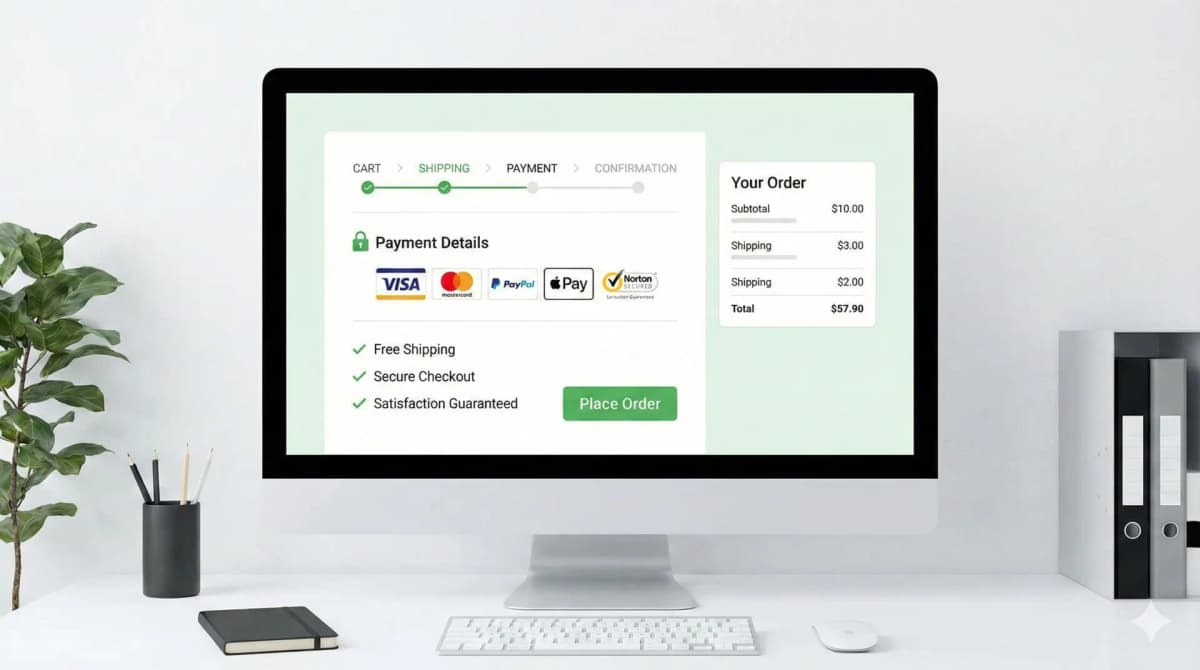
1. Stop splitting checkout across five pages
The single biggest thing I check when I open a client's store is how many page loads sit between "add to cart" and "pay." Every load is a chance for the browser to choke, the customer to get distracted, or a slow app to hang the page. Shopify moved everyone to one-page checkout for exactly this reason, and they were right to.
A single page lets the buyer see the whole job in front of them: address, shipping, payment, done. No mystery about how many steps are left, no "I thought I was finished" surprise on step three. If you're on a custom or headless build and you've recreated a multi-step flow because it "looked cleaner," you've almost certainly traded conversion for aesthetics. I've seen it.
2. Express payments do most of the work on mobile
Most of the traffic I deal with is mobile, and on mobile the keyboard is the enemy. Apple Pay, Google Pay, and Shop Pay let a customer skip every form field and authenticate with FaceID or a fingerprint. Shipping and billing info is already stored on the device, so a checkout that used to take a minute of thumb-typing becomes two taps.
Put these buttons at the top of the cart and the checkout, not buried below the line items. The whole point is that the customer never touches the form. If you're choosing or adding a provider, the order of buttons and which wallets you enable actually matters more than people think. I went into how to weigh that in my payment gateway selection guide.
3. Show the real total early
Nothing tanks a sale faster than a $15 shipping line appearing at the final step. Unexpected cost at the end is the most common abandonment reason there is, and it's entirely self-inflicted. Surface estimated shipping and tax in the cart drawer, not at the confirmation screen.
If you offer free shipping over a threshold, put a progress bar in the cart: "You're $12 away from free shipping." That single element does two jobs, it removes the cost surprise and it nudges average order value up. Both are easy wins. For a fuller breakdown of where stores leak conversions, I keep a running list in my CRO guide.
4. Guest checkout, every time
Forcing account creation before someone can pay is one of the dumbest conversion killers still alive. The customer is trying to give you money and you're handing them a registration form. Take the money first.
You still get the data. Capture it on the thank-you page with a one-click "save your details for next time" offer, or a small discount on the next order. The email is already on the order anyway. Account creation is a retention play, not a checkout requirement, and the moment you confuse the two you lose sales you'll never see in your reports.
5. Validate fields inline, not on submit
The worst pattern in commerce: customer hits "Complete Order," gets yanked back up the page to a field they missed, with no clear sign of what's wrong. Validate as they type. Confirm a field is good the moment it's good, and flag a mistake the moment it's made.
Predictive address lookup helps here too, both for speed and for delivery accuracy, fewer failed deliveries from typo'd addresses. On Shopify checkout this is mostly handled for you, which is one more reason not to rebuild checkout form logic from scratch unless you have a real reason.
6. Trust signals, but skip the padlock theater
Here's the "best practice" that's actually wrong: slapping a row of padlock icons and "100% SECURE" badges on the checkout. Those stopped meaning anything years ago. Everyone has them, so they read as decoration, and stacking five of them can make a page look more sketchy, not less. I've watched generic security badges quietly do nothing.
What actually reassures a real buyer: the logos of payment methods they recognize, a visible and generous return policy, and a way to ask a question without leaving the page. On Shopify Plus you can drop these into the checkout itself with Checkout Extensibility instead of hacking the theme, which I wrote about in detail in my checkout extensibility piece. If you do want badges, build ones tied to real guarantees rather than stock padlocks, my trust badges that convert post covers the difference.
7. Post-purchase upsells beat in-cart distractions
The smart place for an upsell is after the payment clears, before the thank-you page. The sale is already banked, so a relevant add-on can only help. Drop it in the cart and you risk the customer second-guessing the whole order.
Use the actual cart contents and order history to pick the add-on, not a generic "you might also like" block. A wired-in recommendation that matches what they just bought converts; a random four-product grid is noise. Keep the offer to one click to accept, because anything that reopens the payment flow kills the momentum you just earned.
8. Design the checkout for thumbs
"Responsive" isn't the bar. The buyer is holding a phone in one hand and tapping with a thumb, so build for that. Big touch targets. The "Complete Order" button reachable near the bottom of the screen, not stranded at the top. And trigger the right keyboard, numeric pad for card numbers and zip codes, email keyboard for the email field. That last one is a tiny inputmode change that people forget constantly and it makes the form noticeably faster to fill.
9. Keep junk out of the checkout
Page speed at checkout is mostly a discipline problem, not a code problem. On Shopify the platform carries the heavy lifting, so the damage usually comes from apps injecting scripts into the checkout, upsell widgets, survey tools, tracking pixels stacked three deep. Each one is latency the customer pays for at the exact moment they're deciding whether to finish.
Audit what's actually loading. Strip anything that isn't earning its place. I treat the checkout as sacred ground: if an app wants to run code there, it has to justify the milliseconds.
10. Progress bars only if you genuinely need steps
If your model forces a multi-step flow, custom configurators, complex shipping rules, then yes, show a clear progress indicator so the buyer can see the finish line. People complete a process far more reliably when they know how much is left.
But don't add steps just to have a pretty progress bar. The progress bar is a consolation prize for a flow you couldn't collapse, not a feature. One page with no bar beats four pages with a lovely bar, every time.
How I'd review this in a real store
A checklist like this is only worth anything when each line maps to something you can actually open and test, a theme file, an app setting, a checkout rule, a storefront behavior. So I don't take it as theory. I apply it to one real page, integration, or bug and keep the evidence next to the recommendation.
Before pushing any checkout change I run the same checks:
- Confirm the exact surface I'm touching: theme, Admin API, checkout, app, or storefront.
- Test with messy catalog data, missing images, long variant names, empty metafields, weird prices, not a clean demo product.
- Verify it renders where it needs to, including server-rendered HTML where SEO matters.
- Keep a rollback path for every app or theme change.
- Leave a handoff note so the merchant's team knows what's safe to edit.
The traps I watch for: guidance that sounds right but never says what to edit in Shopify; advice that ignores app conflicts or API versions; a change that flatters the desktop screenshot but hurts the mobile checkout; and claims that aren't backed by anything visible on the page.
FAQ
Is one-page checkout always better than multi-step? For most stores, yes. The exception is genuinely complex orders, custom configuration, multi-address shipping, where steps reduce confusion. If you can fit it on one page without cramming, do that.
Should I ever require account creation at checkout? No. Offer guest checkout and capture the account on the thank-you page. The only edge is B2B or wholesale where an account gates pricing, and even then I'd make that flow as light as possible.
Do trust badges actually increase conversions? Generic padlock badges, not really anymore. Specific signals do: recognized payment logos, a clear return policy, real guarantees. Tie the badge to something true and it works.
How much does checkout speed matter? A lot, and it's usually the easiest thing to fix. Most slowness comes from apps injecting scripts into the checkout. Audit what loads, remove what isn't pulling its weight, and re-test on a real mobile connection.
Want this built for you instead of DIY?
I'm Karan — a Top Rated Plus Shopify Expert ($300K+ earned, 100% Job Success). If you'd rather hand this to someone who's done it hundreds of times, let's talk.
🛠️E-commerce Tools You Might Like
Tags
📬 Get notified about new tools & tutorials
No spam. Unsubscribe anytime.
Comments (0)
Leave a Comment
No comments yet. Be the first to share your thoughts!