7 Product Page Design Secrets That Skyrocket Sales in 2025
Discover actionable product page design strategies to boost conversions. Learn how visuals, copy, and UX optimization can turn visitors into loyal customers.

1. Your Photos Are Doing 80% of the Selling
The fastest way to tank a product page: three blurry phone shots on a white background and call it a day. I've audited stores where the product was great, the price was fair, and the page still converted under 1% because the images looked like a marketplace listing from 2012.
Nobody can pick your product up. The photos are the product until it arrives. So treat them like it.
High-res, zoomable, multiple angles
Front, back, side, and tight crops on the stuff people actually worry about: the stitching, the texture, the screen, the seam. If a customer is going to wonder about something, show it before they ask. Shopify's data on 3D models and AR is genuinely strong here, interactions can lift conversion meaningfully, so if your theme supports it and the product warrants it (furniture, eyewear, anything where fit or scale matters), use it. For a $14 phone case, skip it. Not every product needs a 3D viewer, and bolting one on just because the theme has the feature is cargo-cult optimization.
Lifestyle shots that show scale and context
Clean white-background shots are non-negotiable for clarity. But a coffee maker floating in a void tells me nothing. Show it on a real counter, mid-brew, next to a mug, so I can judge the size and picture it in my kitchen. The lifestyle image answers "is this too big for my space" before it becomes a support ticket or a return.
2. Sell the Outcome, Not the Spec Sheet
The single most common thing I fix on audits: descriptions that dump features and forget to say why anyone should care.
- Feature: "100% Merino Wool."
- Benefit: "Warm without the overheating. The Merino regulates temperature on its own, so you're comfortable from the morning commute through dinner."
The feature still goes in, people who care about Merino want to see it, but lead with what it does for them. Structure for skimmers: a headline that states the payoff, one short paragraph with some emotion in it, then a tight bulleted list. Almost nobody reads top to bottom. They scan, and your job is to make sure the scan still sells.
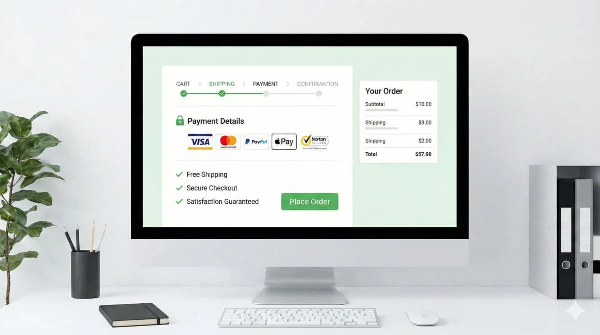
3. The Add to Cart Button Should Be Impossible to Miss
Your CTA is the one element that has to win. If I have to hunt for the buy button, you've already lost some percentage of buyers who were ready.
It needs contrast. Pick a color that doesn't appear anywhere else important on the page and own it. If your brand palette is all soft beige and the button is also soft beige, you've camouflaged the most important pixel on the page.
Size and placement
On mobile, Add to Cart should run nearly full-width and sit in the natural thumb arc, not crammed in a corner. On desktop, keep it above the fold beside the main image. A sticky ATC bar that follows the user down through reviews and specs is one of the highest-ROI changes I make, because the moment someone decides to buy is rarely the moment the button is on screen. Make it always reachable and you capture that impulse instead of losing it to a scroll. If you want the deeper version of this, I broke down button placement and friction in my conversion rate optimization guide.
4. Social Proof Belongs Next to the Money, Not in the Basement
First-time visitor lands on your page. They don't know you. They're deciding whether you're real or whether they're about to hand a card number to a dropshipper. Social proof is how you answer that, and it only works if it's near the decision.
Reviews up top
Don't bury reviews at the bottom of the page where only the already-convinced scroll. Put the star rating directly under the product title, and let people jump to the full reviews from there. The rating near the title does quiet work before anyone reads a single line of copy.
Real customers, not stock photos
A gallery of actual buyers using the product, or an Instagram feed of real UGC, validates the purchase in a way no polished studio shot can. People trust people who look like them more than they trust your marketing. Trust badges play a role too, but most stores do them wrong and end up adding clutter that hurts more than it helps, I wrote up which trust badges actually convert if you want to avoid that trap.
5. Build the Page Mobile-First, For Real
Most of your traffic is already on phones, and that share isn't shrinking. If the page is annoying on a 375px screen, you're leaving money on the table every single day, no matter how good it looks on your 27-inch monitor.
Thumb-zone first
Swatches, size pickers, quantity, the buy button, all of it has to live where a thumb actually goes. Anything that forces a reach or a pinch-zoom is friction, and friction on mobile is conversions walking out.
Strip the layout down
Kill the sidebar on mobile. Stack it the way the decision flows: Title, Price, Images, Selectors, CTA. And go easy on pop-ups, an intrusive interstitial on a small screen isn't just irritating, Google actively penalizes it. I keep a running list of what moves the needle on phones in my mobile commerce optimization notes.
6. Speed Is Part of the Product
A one-second load delay can shave a meaningful chunk off conversions, and the irony is that the gorgeous high-res images from tip #1 are usually the thing dragging the page down. The fix isn't fewer images. It's lighter ones.
On every theme I ship, I make sure of three things:
- Lazy loading: images below the fold don't load until the user scrolls toward them.
- Next-gen formats: WebP (or AVIF) to cut file size hard without visible quality loss. If you're not running a build pipeline, you can squeeze most images down with a quick pass through a free image optimizer before upload.
- Script discipline: every app you install injects JavaScript. Five "small" apps add up to a page that takes four seconds to become interactive. Audit what's actually earning its place on the frontend.
7. Upsell After the Decision, Never Before It
The best moment to sell more is right after someone's already committed to buying. "Frequently Bought Together" and "You May Also Like" are how you nudge average order value up.
The mistake is putting them where they compete with the buy decision. A "you might also like" carousel jammed between the price and the Add to Cart button doesn't raise AOV, it gives a ready buyer a reason to wander off and never come back. Put recommendations after the description, or in the cart drawer once the first item's already in. Keep the primary path to purchase clean, and let the cross-sell happen on the victory lap.
How I'd actually run this
If I were handing this to a team, I wouldn't treat it as seven tips. I'd treat it as a checklist with failure modes attached, because "improve your images" is useless without knowing what "broken" looks like.
For each item: name the decision, name the way it goes wrong, make the smallest change that fixes it, then verify against something real, a session recording, a conversion number, a support ticket that stops showing up.
Quick gut check before you call a product page done:
- Can a first-time visitor tell what the product does and why it's worth it within five seconds?
- Is the Add to Cart button findable on a phone without scrolling or squinting?
- Is the rating near the title, and are real reviews one tap away?
- Does the page become interactive in under ~2.5 seconds on a mid-range phone on 4G?
- Do the upsells sit after the buy decision, not on top of it?
If any of those is a "no," that's your next task, in that order. One fix, shipped and measured, beats a redesign you never finish.
FAQ
What's the single highest-impact change for a low-converting product page? Usually the images, then the mobile Add to Cart. Bad photos and a buried buy button kill more sales than weak copy does. Fix those before you touch anything clever.
Do I need 3D models and AR? Only if the product's value depends on fit, scale, or texture, furniture, eyewear, apparel. For a cheap commodity item it's overhead nobody asked for. Match the tool to the product.
Where should reviews go on the page? Star rating under the title, full reviews reachable from there and again lower down. Don't make the rating something people have to scroll to find.
How fast does a product page need to load? Aim for interactive in roughly 2.5 seconds on a mid-range phone over mobile data, not on your office wifi. Most slowdowns come from unoptimized images and too many apps injecting scripts.
Want this built for you instead of DIY?
I'm Karan — a Top Rated Plus Shopify Expert ($300K+ earned, 100% Job Success). If you'd rather hand this to someone who's done it hundreds of times, let's talk.
🛠️E-commerce Tools You Might Like
Tags
📬 Get notified about new tools & tutorials
No spam. Unsubscribe anytime.
Comments (0)
Leave a Comment
No comments yet. Be the first to share your thoughts!