The Ultimate Guide to Conversion Rate Optimization for Online Stores: From Traffic to Transactions
Master the art of Conversion Rate Optimization (CRO) with 10 actionable strategies to turn your e-commerce traffic into consistent sales and loyal customers.

Why Traffic Alone Isn't Enough for E-commerce Success
A store doing 10,000 visitors a month at 0.5% converts the same as a store doing 1,000 visitors at 5% — except one of them is burning ad budget to do it. I've audited dozens of Shopify stores where the owner's whole growth plan was "buy more traffic," and the conversion rate was sitting at half a percent the entire time. More traffic into a leaky funnel just means you lose money faster.
CRO is the work of getting more of the people already on your site to buy. Most "CRO advice" you'll find is button-color trivia. The stuff that actually moves the needle is boring: page speed, checkout friction, and answering the questions a buyer has before they bounce. Here's how I approach it on real stores, roughly in the order I'd fix things.
1. Speed First, Because Nothing Else Matters If the Page Is Slow
You can have the best copy and the prettiest hero image on earth, and it won't help if the page takes five seconds to paint on a mid-range Android phone. Amazon's old research pegged a one-second delay at roughly a 7% conversion hit, and that ballpark has held up across every store I've measured. Speed is the one CRO lever I'd call genuinely underrated — most merchants obsess over the funnel and ignore the fact that a third of their visitors leave before the funnel even loads.
On Shopify, the usual culprits are app bloat and a theme that loads everything up front.
- Audit your apps. Every app you install drops a script tag onto the storefront, and most don't clean up after themselves when you uninstall. I've found stores carrying script tags from apps that were removed a year ago. Go through your
theme.liquidand your app embeds and rip out anything dead. - Serve modern images. WebP (or AVIF) plus proper
loading="lazy"on anything below the fold. Shopify's image CDN will do the format conversion for you if you let it — a lot of themes hardcode.jpgand skip it. - Don't ship CSS the page doesn't need. Get the above-the-fold content rendering immediately and defer the rest.
I wrote a deeper breakdown of this in Shopify store speed optimization for conversions if you want the technical version. And if you're trying to figure out what's slowing down a competitor's store, run it through my Shopify theme detector to see the theme and apps they're loading.
2. Build for the Thumb, Not the Mouse
Most of your traffic is on a phone — for the stores I work on it's usually 65 to 80% of sessions. A desktop layout squeezed down to 375px is still a desktop layout, and you can feel it the second you try to actually buy something on it.
- Sticky add-to-cart. On a long product page, the buy button should follow the user down the page. Don't make them scroll back up to commit.
- Make search obvious. Mobile shoppers who use search convert at multiples of those who don't. Don't bury it three taps deep in a hamburger menu.
- Real touch targets. Minimum 44x44 pixels per Apple's own guidance. If your variant swatches or quantity steppers are tiny, people misfire and give up.
3. AI Personalization — Useful, but Don't Get Carried Away
I build with generative AI a lot, so I'll be honest about where it actually pays off in CRO and where it's hype.
The genuinely useful stuff:
- Recommendations based on intent, not just "frequently bought together." Pulling from browsing behavior beats the default Shopify recommendation block, especially on stores with a deep catalog.
- A support agent that answers product questions in real time. "Does this fit a 15-inch laptop?" is the kind of question that, unanswered, becomes an abandoned cart. A chatbot that can actually answer it removes that friction.
The overrated stuff: AI-generated "personalized copy" that changes the headline based on traffic source. It demos well and almost never beats a clean, well-written page in a real test. Don't spend your first month here. Get the basics right, then experiment.
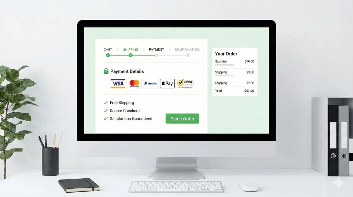
4. The Shortest Possible Path to Checkout
Friction is where conversions go to die. Every extra step, field, or moment of doubt between "I want this" and "I bought this" costs you buyers. Shopify's one-page checkout helped, but there's still plenty you can mess up.
- Guest checkout, always. Forcing account creation before purchase is one of the oldest, most expensive mistakes in e-commerce. Let people buy first; ask them to make an account after, if at all.
- Show progress if the flow is multi-step. People tolerate a few steps if they can see the finish line.
- Turn on the wallets. Shop Pay, Apple Pay, Google Pay. One-tap checkout consistently beats manual entry, and Shop Pay in particular has the data to back it up. This is some of the cheapest conversion lift available — it's a settings toggle.
I go deep on the checkout layer in e-commerce checkout best practices, since it's where most of the recoverable revenue actually hides.
5. Trust, Because Buying Online Is an Act of Faith
Your customer can't hold the product. They're handing card details to a store they found ten minutes ago. Everything that signals "other people bought here and didn't regret it" lowers the perceived risk.
- Real customer photos. UGC outperforms studio shots on trust because it's obviously not staged.
- Reviews where people are deciding. Star ratings on product and collection pages, via Judge.me, Loox, or similar. Reviews buried on a separate tab might as well not exist.
- Payment and security icons near the buy button — not in the footer where nobody looks.
- A return policy you're not hiding. A visible 30-day return policy does more to close a sale than most "trust badges" do.
On that last point: not all trust badges are created equal, and some of the generic "100% secure" stamps actively look scammy. I covered which ones actually work in how to create trust badges that convert.
6. Product Pages That Do the Selling
The product page is the closer. If it leaves a question unanswered, the customer fills the gap with doubt and leaves.
- Sell the benefit, not the spec. "Waterproof fabric" is a feature. "Stay dry in a downpour" is a reason to buy. Lead with the second one, back it with the first.
- Use video. A short clip showing scale, fit, and movement closes the gap that static photos can't. It consistently outperforms images-only pages.
- Comparison tables for variants. If you sell three versions of something, don't make the buyer reverse-engineer the difference. Lay it out.
More on layout, gallery order, and copy structure in product page design and sales tips.
7. Urgency and Scarcity — Real Only
FOMO works. Fake FOMO works until someone notices, and then it torches your credibility. I won't install a scarcity widget that lies, and you shouldn't either.
- Low-stock alerts that are true. "Only 3 left" is great when there really are 3 left, and a liability when the number resets every time you reload.
- Countdown timers tied to real deadlines — a genuine sale end, or "order within 4 hours for next-day dispatch." Evergreen timers that restart per visitor are the kind of thing customers screenshot and roast you for.
- Live activity feeds, if the activity is real. A busy store feels safe to buy from. A fake "someone in London just bought this" feels like a casino.
8. Test, Because Your Opinion Is a Guess
What converts for a £400 watch brand won't convert for a £20 supplement. Anyone telling you "orange buttons always win" is selling you a blog post, not a result. The only way to know is to test on your own traffic.
Start with the things that move money, not pixels:
- Headline and offer. "Free shipping on all orders" vs. "10% off your first purchase" can swing conversion meaningfully — and which wins is genuinely unpredictable until you run it.
- CTA contrast. Not color theory — contrast. A button that stands out from its background beats one that blends in, brand palette be damned.
- Hero image. Lifestyle (someone using it) vs. clean studio. Different audiences respond differently; let the data decide.
One caveat people skip: don't call a test until it has enough conversions to mean something. A low-traffic store reading a 12% "lift" off 30 orders is reading noise. If you don't have the volume for a clean A/B test yet, focus on the speed, checkout, and trust fixes above — those are near-certain wins that don't need statistical significance to justify.
Where to Actually Start
If I had to rank it: fix speed and checkout first, because they're high-impact and don't require testing to validate. Get trust signals and product pages right next. Save A/B testing and AI personalization for when you've got the fundamentals and enough traffic to learn from. Most stores I see have it backwards — fiddling with button colors while the page takes four seconds to load and checkout demands an account. Get the boring stuff right and the conversion rate takes care of itself.
FAQ
What's a good conversion rate for a Shopify store? Depends entirely on the niche and traffic source, but 1–3% is a common range for established stores. If you're under 1%, something's broken — usually speed, checkout, or trust — before it's anything subtle.
How long until CRO changes show results? Speed and checkout fixes show up fast, often within days, because they remove hard blockers. A/B tests take longer — you need enough conversions to trust the result, which on a smaller store can mean weeks.
Do I need a CRO app or agency? For the basics, no. Most of the biggest wins are theme and settings work you can do yourself or with a developer. Apps and agencies make more sense once you've exhausted the obvious fixes and need rigorous testing infrastructure.
Is page speed really that important for conversions? Yes, and it's the most underrated lever I see. A slow store loses buyers before they ever reach the part you optimized. Fix it first.
Want this built for you instead of DIY?
I'm Karan — a Top Rated Plus Shopify Expert ($300K+ earned, 100% Job Success). If you'd rather hand this to someone who's done it hundreds of times, let's talk.
🛠️E-commerce Tools You Might Like
Tags
📬 Get notified about new tools & tutorials
No spam. Unsubscribe anytime.
Comments (0)
Leave a Comment
No comments yet. Be the first to share your thoughts!