10 Mobile Commerce Optimization Tips That Actually Increase Conversions
Over 70% of ecommerce traffic is mobile, but conversion rates lag 50% behind desktop. Here are 10 proven strategies to close that gap — from speed optimization to thumb-friendly UX.

1. Speed Is Everything
I've watched session recordings where someone taps a product, stares at a white screen for four seconds, then closes the tab. They were ready to buy. The store just didn't load fast enough to let them.
Google's own number puts it at 53% of mobile visitors bouncing once load time crosses 3 seconds. I believe it, because I've seen it happen on stores that looked fine to the merchant on their office wifi.
What actually moves the needle:
- Serve images as WebP. It's 25-30% smaller than JPEG for the same visual quality, and Shopify will do most of it for you if you stop uploading 4000px hero shots. (I run product images through my image optimizer before they go anywhere near a theme.)
- Lazy load anything below the fold so the phone isn't downloading the footer before the customer sees the price.
- Audit your third-party scripts. Every review widget, chat bubble, and tracking pixel adds 50-200ms. Half the apps merchants install never get used.
- Put static assets on a CDN.
- Inline the critical CSS for above-the-fold content so the first paint doesn't wait on a stylesheet.
Run your store through PageSpeed Insights on the mobile tab, not desktop. If you're under 70, that's where your money is leaking. I wrote a deeper breakdown on this in Shopify store speed optimization if you want the full teardown.
2. Build for the Thumb, Not the Cursor
Nobody is using a mouse on their phone. They're holding it one-handed on a train, thumb stretching to reach the top corner where you put the "Add to Cart" button. So they don't tap it.
How I lay out mobile interactions:
- Primary CTAs go in the bottom half of the screen, where the thumb actually lives.
- Tap targets at 48x48px minimum. Apple says 44px, which is the floor, not the goal.
- Real spacing between tappable things. Fat-finger mistaps are a measurable conversion killer, and a frustrated tap on the wrong link reads as a bounce.
- A sticky bottom bar beats a hamburger menu for the actions people actually want.
- Keep search visible. Buried search is dead search.
3. Get Checkout Down to One Page
Every extra checkout step costs you somewhere in the range of 10-15% of the people who started. On mobile that's brutal, because the customer is one notification away from forgetting you exist.
What I build:
- Single-page checkout, two screens at the absolute most.
- Guest checkout as the default. Forced account creation is one of the biggest self-inflicted abandonment causes there is, somewhere around a third of drop-offs in most studies I trust.
- Autofill the boring fields. Pull city and state from the postal code instead of making someone type them.
- Show the order summary inline. Don't make people leave to check what they're paying.
- Express payment up top: Apple Pay, Google Pay, Shop Pay. A returning customer should be able to buy in two taps.
On Shopify Plus, Checkout Extensibility lets you actually build the one-page flow instead of faking it with apps. If you're on Plus and not using it, you're leaving the best tool in the box.
4. Shoot Product Images for a Phone, Not a Monitor
That gorgeous wide hero shot that looks cinematic on a 27-inch display? On a 6-inch screen the product is a postage stamp floating in negative space. Mobile needs its own crop.
- Use square or 4:5 portrait. They fill the screen instead of wasting it.
- Let the product take up 80% of the frame. People are deciding with their thumb, not squinting.
- Pinch-to-zoom is non-negotiable. They want to see the stitching.
- Swipeable galleries beat tiny dot navigation every time.
- Keep files under ~200KB. Again, run them through compression first.
- Short product video, 15-30 seconds, if the product benefits from motion. Don't force it on everything.
I'll add the one tip everyone repeats that I mostly ignore: "use a video on every product page." No. A spinning render of a phone case does nothing. Video earns its load cost on apparel, anything with texture, or anything where scale is hard to judge from a still. On a flat lay of a notebook, it's just weight.
5. Make Search Earn Its Keep
People search more on mobile because scrolling a category grid with their thumb is tedious. If your search returns garbage, a big chunk of your traffic hits a wall and leaves.
- Autocomplete with product thumbnails, so they recognize the result visually.
- Typo tolerance. "shoees" has to return shoes. It will happen on a phone keyboard.
- Save recent searches locally.
- Show popular searches on the empty state instead of a blank box.
- Filters as sliders and chips, not dropdowns. Native mobile dropdowns are miserable to use.
6. Cut Form Fields Until It Hurts
Count your checkout fields right now. If it's more than seven, some of them are costing you customers and doing nothing for you.
Keep:
- Name as a single field, not split into first and last
- Address with autocomplete
- Payment, one-tap if you can
Cut, today:
- Phone number, unless the carrier genuinely needs it
- "How did you hear about us?"
- Company name
- A separate billing address. Make it a checkbox that defaults to "same as shipping."
7. Put Trust Where the Anxiety Is
On mobile, nobody scrolls back up to your header to check your trust badges. The doubt shows up at two specific moments: deciding to add to cart, and handing over card details. Surface trust right there.
- Payment security badges next to "Add to Cart," not floating in the footer.
- Return policy in a collapsible block on the product page.
- Star ratings visible immediately, not hidden behind a "Reviews" tab.
- Real customer photos in reviews. They consistently outperform polished stock shots because they read as honest.
- Shipping cost and delivery estimate shown before checkout, not as a surprise on the final screen. Surprise shipping is the classic abandonment trigger.
More on how the product page itself does this job in my product page design notes.
8. Don't Sleep on Push
Push notifications get opened in minutes. Email sits unread for hours. If push is your only marketing channel, you're slow. If push isn't a channel at all, you're ignoring the fastest line to your customer's attention.
What converts for me:
- Back-in-stock alerts. High intent, they asked for it.
- Price-drop pings on items they viewed.
- Cart reminders inside the first hour, while the intent is still warm.
- Order status updates. Boring, but they build the trust that drives the second purchase.
- Time-boxed sale alerts with a real countdown.
9. Optimize for Bad Connections
Not everyone is on 5G. Test on a throttled connection and your store will feel different, because for a lot of your customers it is different, especially in the markets where ecommerce is growing fastest.
- Skeleton screens instead of spinners. Perceived speed matters as much as real speed.
- Progressive blur-up image loading so something shows immediately.
- Cache aggressively with service workers.
- Throttle to 3G in Chrome DevTools and actually click through your own checkout. Most merchants have never done this once.
I'll skip AMP. It solved a problem from a different era, and on a modern Shopify theme it's more maintenance pain than payoff.
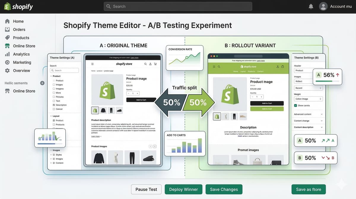
10. A/B Test Mobile on Its Own
Here's the mistake I see constantly: a merchant tests a change on desktop, picks the winner, and ships it to mobile too. Mobile users behave differently. The winning desktop variant loses on a phone all the time. Test them separately or don't bother.
Mobile-specific tests worth running:
- Sticky "Add to Cart" bar vs. a standard inline button
- Bottom nav vs. hamburger
- Single-column vs. two-column product grid
- Accordion FAQ vs. visible FAQ on the product page
- Express checkout above the fold vs. tucked in the cart drawer
If you want the framework I use to prioritize which tests to even run, it's in my conversion rate optimization guide.
The Bottom Line
The stores that win on mobile aren't the prettiest. They're the ones that delete friction between "I want this" and "Order confirmed." Start with speed, fix checkout next, then work through everything in between.
The compounding is real. Shaving load time lifts conversion. Cutting form fields lifts completions. Neither one is a magic number, but stack five of them and the effect is hard to argue with on your dashboard.
Most of your competitors are still building desktop-first and patching mobile after. Build it the other way around and that gap is yours.
Want a second set of eyes on your mobile build? [Email me](mailto:[email protected]).
What are the benefits of simplifying my mobile checkout process?
Fewer steps, fewer abandoned carts. Get it to one or two screens, default to guest checkout, and autofill whatever you can pull from the postal code. On a phone, every screen you remove is one fewer chance for a notification to steal your customer.
Want this built for you instead of DIY?
I'm Karan — a Top Rated Plus Shopify Expert ($300K+ earned, 100% Job Success). If you'd rather hand this to someone who's done it hundreds of times, let's talk.
Tags
📬 Get notified about new tools & tutorials
No spam. Unsubscribe anytime.
Comments (0)
Leave a Comment
No comments yet. Be the first to share your thoughts!