Beyond the Shield: How to Create Trust Badges That Actually Convert
Stop using generic trust badges that customers ignore. Learn how to design and place specific, credible badges that build real trust and boost your e-commerce conversion rate.

Which Trust Badges Actually Move the Needle (And Which Are Placebo)
Most of the trust badges I see on Shopify stores do nothing. A row of pastel "100% Secure" shields under the add-to-cart button is decoration. Buyers have seen those exact icons on the scammy dropshipping store that took their money in 2019, so if anything they read as a warning sign.
The badges that actually pull weight are the ones tied to a real, checkable claim. Payment logos the customer recognizes (the cards they own). A return policy that links to the actual policy. A delivery date that's specific. Those answer a doubt the page already created. The generic shield answers nothing, because nobody arrived at your product page worried about whether SSL exists.
So before you add a single icon, get clear on the difference: a trust signal answers a buyer's doubt. A trust badge is just the visual you hang on it. You can have great badges and zero signal.
What People Lump Under "Trust Badges"
- SSL / HTTPS — the padlock in the browser bar. Real and important, but the browser already shows it. A custom "SSL Secured" graphic on the page is redundant at best.
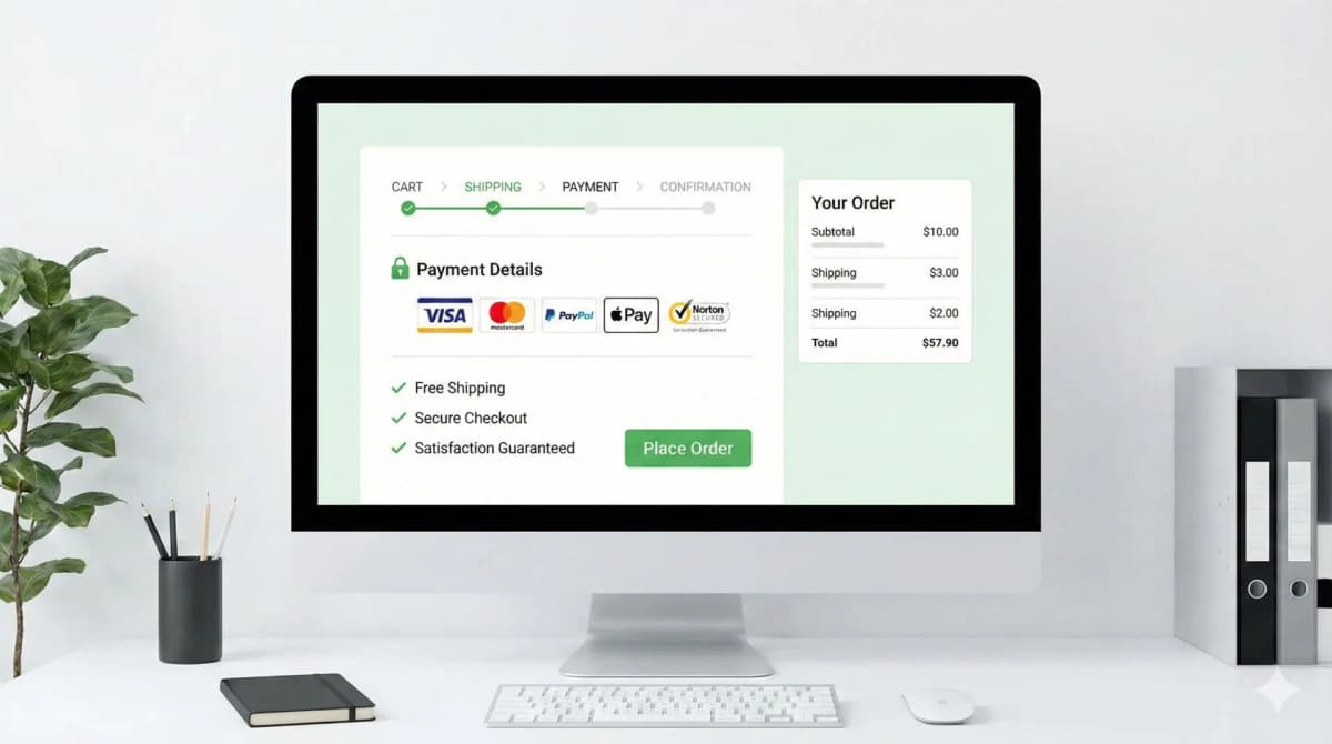
- Payment provider logos — Visa, Mastercard, PayPal, Apple Pay, Shop Pay. These do work, because they tell the buyer "you can pay the way you already trust."
- Guarantees — free shipping, 30-day money-back, warranty. Strong, if they link to a real policy.
- Third-party endorsements — Google Customer Reviews, BBB, "As seen in." Strong because the credibility is borrowed from a source the buyer already trusts. You can't fake these without it backfiring.
The split that matters: signals that borrow credibility from somewhere real (a card network, a review platform, your own published policy) versus signals you drew in Canva. The first group converts. The second group is noise.
Match the Badge to the Doubt, Not the Page
Buyer anxiety changes as they move toward checkout. Put the proof where the doubt lives.
Product page. The doubt here is "is this any good and is it worth it." This is where reviews, ratings, warranty length, "ships in 2 days," authenticity proof, and material/sourcing claims belong. Payment security means nothing here because nobody's reaching for their wallet yet. I get into the page-level mechanics of this in my product page design notes.
Cart and checkout. Now the doubt flips to "is my money and card data safe, and what if this goes wrong." This is where payment logos, a clear return line, and "secure checkout" copy earn their spot. Don't crowd it. If you've read my take on checkout best practices, you'll know that the checkout page is the worst possible place to introduce new friction or visual clutter.
A badge that's right on the checkout page is often dead weight on the product page, and vice versa.
Clarity Beats Decoration
A trust signal has to land in under a second. Specific copy beats a vague icon every time.
- Weak: a shield icon that says "Trusted Site."
- Strong: a truck icon that says "Free shipping on orders over $50."
- Weak: "Guaranteed Secure" in legal-ish font.
- Strong: the actual card logos the buyer can pay with.
The strong versions set a concrete expectation. The weak ones ask the buyer to take your word for something abstract, which is exactly the thing they're already unsure about.
The Badges That Backfire
This is the part most guides skip. Some trust elements actively cost you sales:
- The Canva shield wall. Five generic security icons in a row under the buy button reads cheaper, not safer, especially on a premium product. I've seen removing them lift the feel of the page more than any badge ever added.
- Fake urgency and fake certification. "Only 3 left!" that resets on refresh, or a made-up "Certified Quality" seal. Buyers spot these. Once they catch one fake signal, every real signal on the page loses credibility too.
- Return/guarantee badges that link nowhere. A "30-Day Returns" badge that isn't clickable and isn't backed by a findable policy reads as a claim you won't honor.
- Icons that look clickable but aren't. People tap them, nothing happens, trust drops.
- App-injected badge bars that shift layout on mobile. If the badge row loads late and pushes your add-to-cart button down on a 375px screen, you're trading a tiny trust bump for a real conversion loss from layout shift and rage-taps.
The pattern: anything that looks templated, unverifiable, or broken does the opposite of its job.
How I Audit a Page
When I review trust elements on a store, I don't start by adding icons. I start by listing the buyer's actual doubts for that product: payment safety, delivery timing, return risk, authenticity, sizing, freshness, warranty, support. Then I check whether the page answers each one, and remove anything that doesn't map to a real doubt.
- Map every badge to a specific buyer concern. No concern, no badge.
- Cut anything that just repeats what checkout already proves.
- Put each proof next to the decision it supports.
- Use real policy copy next to icons where the claim needs explaining.
- Check mobile spacing so nothing pushes add-to-cart below the fold.
If you want to see which apps a competitor is using to inject their badges (and whether it's a real review platform or a decorative one), my theme detector will surface the app and theme they're running.
A Starting Point in Liquid
I prefer text-backed trust notes wired to real store data over decorative badge images. This pulls a product-specific warranty from a metafield and links the actual refund policy, so nothing on the page is a claim you can't back:
{% if product.metafields.trust.warranty != blank %}
  <p class="trust-note">{{ product.metafields.trust.warranty | escape }}</p>
{% endif %}
{% if shop.policies.refund_policy %}
  <a href="{{ shop.policies.refund_policy.url }}">Return policy</a>
{% endif %}
The point: the copy points at something real, a policy URL or a per-product fact, not a stock promise everyone uses.
What I'd Ship First
Fewer, stronger signals beat a wall of icons. My default order:
- Replace generic icons with product-specific proof.
- Link every policy claim to the actual policy.
- Show delivery and return notes right beside the purchase controls.
- Reserve the badge's space in the layout so nothing shifts on load.
- Measure add-to-cart and checkout-start rates before and after.
That last point matters most. Trust elements aren't set-and-forget, and what lifts conversion on a $20 impulse buy isn't what works on a $400 considered purchase. Run a real A/B test, give it a few weeks, and let add-to-cart and checkout-start tell you what's working instead of guessing. If you want the broader framework for testing changes like this, I cover it in my CRO guide for online stores.
Trust badges don't create trust. They display trust you've already earned with good products, honest policies, and a checkout that works. Show that clearly, put it where the doubt is, and skip the shield wall.
FAQ
Do trust badges actually increase conversions? The real ones can, when they answer a doubt the buyer has at that point in the funnel. Payment logos at checkout, reviews on the product page, a linked return policy. Generic security shields usually do nothing measurable, and a cluttered row of them can hurt. Test it on your own store rather than trusting a blanket "yes."
Where should I place trust badges on a Shopify store? Put product-quality proof (reviews, warranty, shipping speed) on the product page near the buy button, and payment/security proof on the cart and checkout pages. Don't bury them in the footer, and don't dump everything everywhere.
Are free trust badge generators worth using? For the visual, sometimes. But a generic generated shield is the exact look buyers associate with sketchy stores. I'd rather have plain text tied to a real policy than a polished badge that means nothing.
How many trust badges should a page have? As few as do the job. One strong, specific signal per real doubt. A row of five lookalike icons reads as filler and can make a premium page feel cheaper.
Want this built for you instead of DIY?
I'm Karan — a Top Rated Plus Shopify Expert ($300K+ earned, 100% Job Success). If you'd rather hand this to someone who's done it hundreds of times, let's talk.
🛠️E-commerce Tools You Might Like
Tags
📬 Get notified about new tools & tutorials
No spam. Unsubscribe anytime.
Comments (0)
Leave a Comment
No comments yet. Be the first to share your thoughts!